Northkin Digital

Portfolio

Our work

Six website designs for the sectors we work with most – engineering, energy, manufacturing, and established service businesses.

Our approach

Designed around the problem, not a template

Every design starts with what the business needs the site to do. Not a theme with a logo dropped into it, and not a layout that looks impressive in a portfolio but confuses the person trying to hire you.

Each design below takes a problem we see again and again in a particular sector – a manufacturer whose catalogue cannot be filtered, a contractor whose phone number sits three clicks deep – and works through how we solve it.

What every design has to do

Selected work

Six problems, and how we solve them

The sectors we work with most, and where a weak website costs the most in work that never arrives.

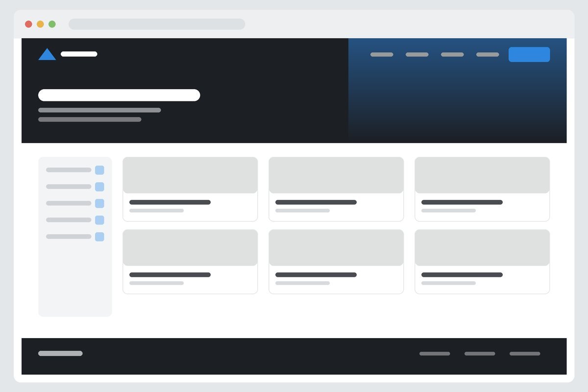
Website design for structural engineering, showing a dark hero with sector credentials
Engineering

Making technical credibility legible

A website design for structural engineering. Sector experience leads, technical documents stay easy to reach, and an enquiry is one click from any page.

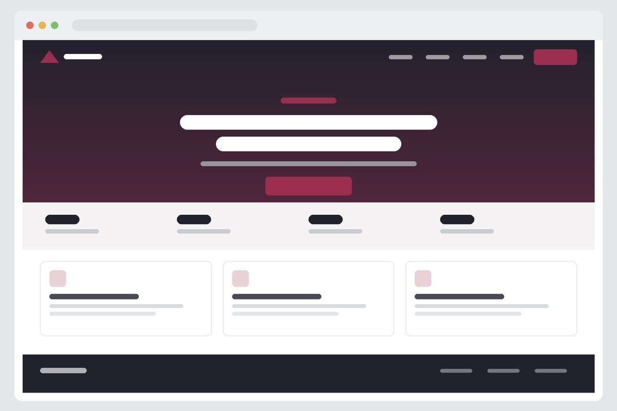
Website design for commercial HVAC contracting, with a centred hero and service cards
HVAC

Built around the emergency call-out

A website design for commercial HVAC contracting. Contact routes stay pinned to every screen, and the service area is answered above the fold rather than three clicks in.

Website design for an energy supplier, with a split hero and supporting content band
Energy

One page, two reading paths

A website design for energy supply, serving two audiences at once – buyers who want specifications, and directors who want the business case – without writing everything twice.

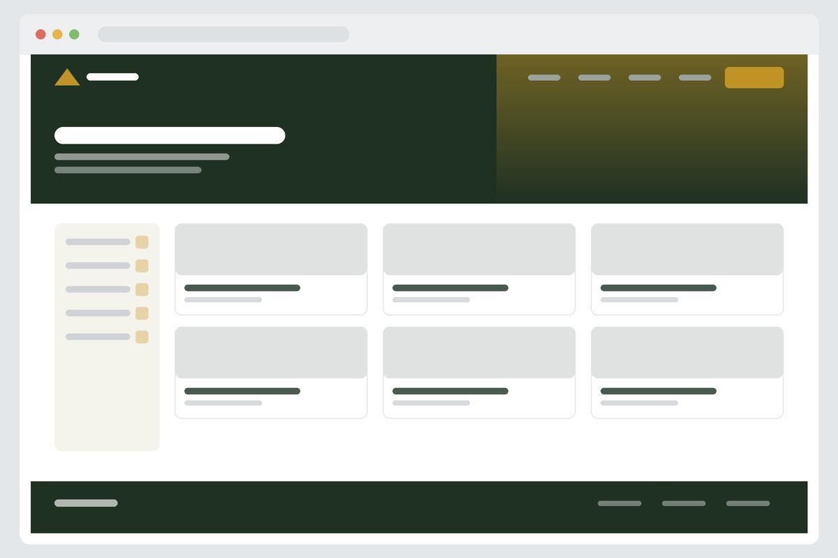
Website design for a manufacturer, showing a filterable product catalogue
Manufacturing

A catalogue people can actually filter

A website design for manufacturers with a large product range: real filtering, consistent spec sheets, and datasheet downloads tracked as conversions instead of invisible clicks.

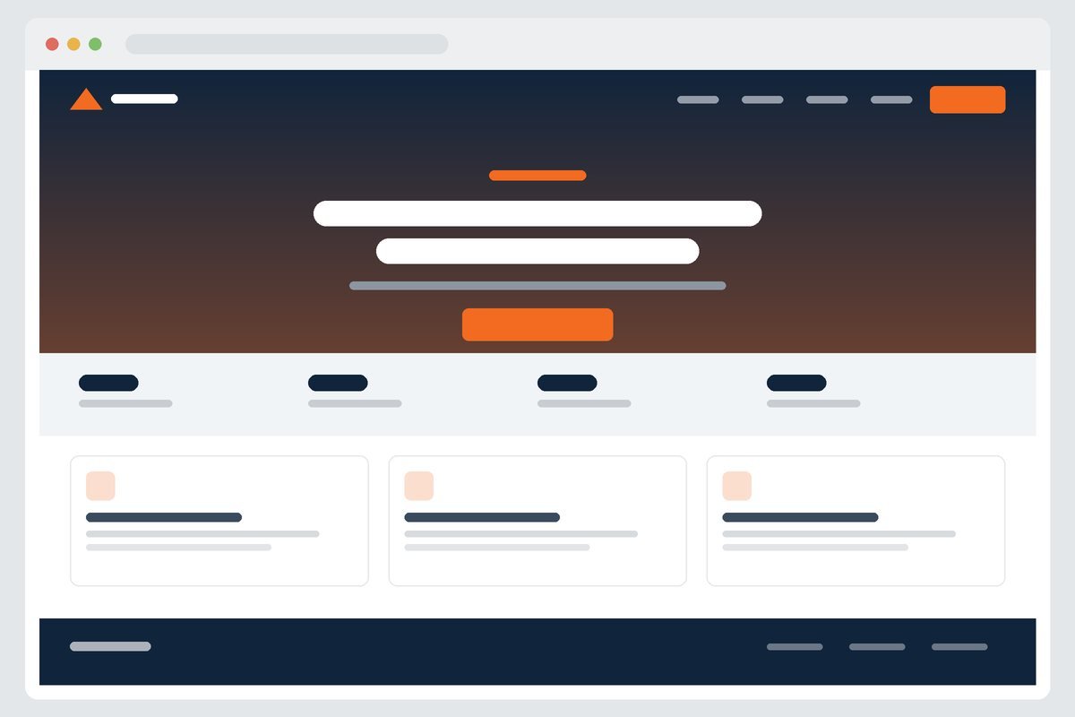
Website design for a management consultancy, with a centred statement hero
Consultancy

Fewer words, better ones

A website design for management consultancy, replacing three screens of generic positioning with one clear statement, the evidence behind it, and a way to start a conversation.

Website design for commercial grounds maintenance, with a service listing layout
Landscaping

Contracts, not one-off jobs

A website design for commercial grounds maintenance, aimed at facilities managers rather than homeowners and structured end to end around a tender-ready enquiry.

Our format

How we write up a project

Not a gallery of screenshots. A written account of the problem, the decisions, and the outcome – so you can judge the thinking, not just the visuals.

01

The starting point

What was wrong with the original site, in specific terms – structure, performance, mobile experience, and what it was costing the business.

02

Goals

What the redesign had to achieve, agreed in writing before design work started.

03

Strategy

Page structure, the questions each page had to answer, and how enquiries were meant to happen.

04

Visual direction

The updated design approach, and how it was kept consistent with existing brand assets.

05

Development

How the site was built in WordPress and what the team can edit themselves.

06

Mobile

How the layout and navigation were handled on phones and tablets.

07

Content

How existing technical information was reorganised without losing accuracy.

08

SEO migration

How URLs, redirects, metadata, and existing rankings were protected through the move.

09

Analytics

What tracking was set up, and which actions are now measured.

10

Results

What actually changed after launch – reported only once there is real data to report.

Want something like this for your business?

Tell us what your business does and what the site needs to achieve. We will come back with a written scope and an itemised quote.

Scroll to Top